Brighten Your Small Business Brand with a Splash of Color Printing
Can color shape the way customers see your small business?
Visually speaking, certainly. People make snap decisions about the colors they see and where they see them, often without noticing. One study from the University of Winnipeg Department of Administrative Studies found color has a profound subconscious effect on our first impressions with products we consider purchasing.
Harnessing a color palette to empower marketing, however, may not be as easy as some would have you believe. Color preferences vary from one customer to another, so a lime green logo or a ruby red promotional advertisement will naturally attract some as quickly as it turns off others. After all, people like what they like.
That said, companies can control whether their color choices for marketing materials align effectively with an ideal brand perception they wish to broadcast to the world. How can small businesses leverage color to enhance brand identity and awareness?
Take a look at your logo
Color patterns in logos can say a lot about a company, but they can just as easily muddle a valuable message.
It’s important to consider the audience at all times when choosing how to use color in your logo. Every organization targets marketing personas, or composites of people or businesses they believe represent key sales demographics. Part of the persona creation process involves establishing goals for these identities: what motivates them, what don’t they like, how do they feel about the industry, etc. Logos visually introduce these personas, as well as flesh-and-blood customers, of course, to your organization before any transaction takes place.
When targeting younger consumers, a logo with neon colors and funky typefaces could be highly successful because it reflects their youthfulness. However, the same logo may appear unprofessional to reserved B2B customers. What does your logo say about you?
Analyze the messages you and your competition send with color
So, how can you ensure your color message stays on point from square one? First, make sure your color choices differentiate you from the rest of the market. Research your competitors and note not only what colors they use, but how they use them. For instance, if one uses green, purple and brown in its logo, specify whether it uses warmer or cooler shades and what effect the combination of these colors has on you. Deeper earth tones, for instance, may be an effective method for promoting eco-consciousness.
Next, perform the same color analysis on yourself. Are you employing colors that don’t necessarily fit your message? How do the colors in your logo reassure your target audience and express value? How do they separate you from your steepest competition?
Finally, try to tell a story with your color choices, not just in logos but in all marketing initiatives. Returning to the earth tones example from before, mixing deep grays and greens with a sharp yellow subtly may say to customers, “After searching far and wide for a solution, you’ve unearthed gold in my small business.”
Get noticed with correct color combinations
Print marketing is a great way to reach a big audience as simply as possible, but choosing the right colors can be tricky. Take these tips to heart while designing your next batch of business cards, postcards, posters or brochures:
- Create bold contrast: Provocative print marketing doesn’t always require bright, flashy colors. All designers need is stark contrast between colors to draw the eye in. Complementary colors, or colors on opposing sides of the color wheel, are an easy way to create vibrant contrast. Fun fact: Movie posters feature complementary hues of blue and orange more than any other color combination, according to research from BoxOfficeQuant.
- Legibility comes first: Continuing from our last point, complementary colors should be employed visually but not necessarily textually. Tinting text often reduces a person’s ability to read what’s written. Always use black or very dark text on a lighter background and white or very light text on a darker background to stay colorful and coherent.
- Avoid the rainbow effect: Don’t go overboard by adding too many colors without adhering to a strict palette. Research triadic and tetradic color combinations to diversify the colors in your marketing materials without hurting your mission.
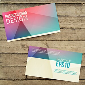
- Unify and diversify: Although the color palette your business lands on should stay consistent across all printed materials, don’t be afraid to emphasize certain colors when it could best help you stand out. A flyer with your brightest color choices sent through the mail might grab the attention of the recipient, while a business card with only a touch of color mixes professionalism and legibility, as well as your unique character.
Find a print marketing vendor with high-quality equipment and affordable service
After conducting countless hours of research, pouring over color swatches, testing and retesting palette options, what could be worse than choosing a print vendor whose machinery can’t match the exact hue you were hoping for?
Color alignment across all print marketing collateral demonstrates professionalism, so be sure to partner with a print vendor with the right technology for everything from vinyl banners to envelopes to business cards.